
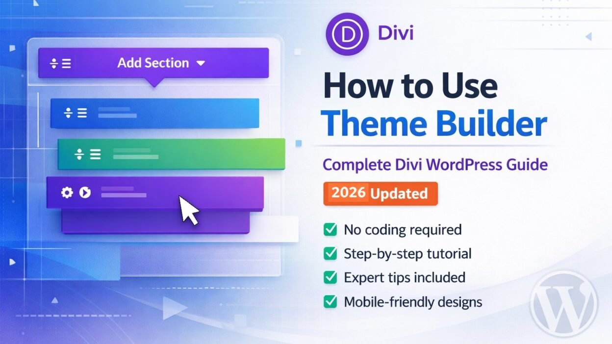
When I first installed Divi on my WordPress site, I stared at the screen for a solid five minutes, wondering where to even begin. I’d heard endless praise about the Elegant Themes Divi page builder, but actually using the theme builder feature felt genuinely intimidating. I didn’t know the difference between the page builder and the theme builder, didn’t understand how global templates worked, and couldn’t figure out where to access the theme builder dashboard.
Now, after building dozens of WordPress websites with Divi and mastering both the page builder and theme builder, I can walk you through everything I wish someone had explained to me on day one. This guide covers the complete WordPress customization process using Elegant Themes’ powerful visual builder interface, from basic setup to advanced theme builder settings.
Let me share exactly how to use the theme builder in WordPress with Elegant Themes Divi, based on my real experience learning this tool from scratch.
What Is Divi Theme Builder and Why WordPress Users Love This Visual Builder Interface
The Divi theme builder is a visual design tool that lets you create beautiful WordPress page layouts without writing a single line of code. Think of it like building with digital blocks. You drag elements onto your page, drop them where you want them, and customize everything visually right on your screen.
I remember the first time I tried it. I was staring at a blank WordPress dashboard, wondering how I’d create something that looked professional. With Divi’s visual builder interface, I clicked a button that said “Use Divi Builder,” and suddenly I had access to hundreds of design elements and divi modules I could just click and add.
The best part? I saw exactly what my page would look like as I built it. No more guessing, no more switching between editing screens and preview modes.
Before I discovered the Elegant Themes visual builder, I used the default WordPress theme options. It worked fine for basic blog posts, but when I wanted to create a stunning homepage or a custom landing page, I hit a wall. The standard WordPress customization tools just couldn’t do what I needed.
Divi theme builder sits on top of WordPress and gives you superpowers. Instead of typing text into a plain box, you’re working with a complete design interface. You can add image sliders, call to action buttons, pricing tables, testimonial sections, and dozens of other divi modules that would normally require a developer.
I’ve built everything from simple blog layouts to complete business websites using Divi. Each time, I’m amazed at how much I can accomplish without touching code.
Here’s something that confused me at first. Divi comes in two forms, and understanding this fundamental difference helped me choose the right option for WordPress customization.
Divi as a WordPress theme gives you the complete package. When you install Divi as your WordPress theme, the page builder is built right into your theme, and you also get access to the Divi theme builder, which lets you create site-wide templates and custom headers and footers. This is what I use on most of my websites now because it provides complete WordPress theme customization control.
Divi Builder as a plugin is your other option. If you already have a WordPress theme you love and don’t want to change it, you can install just the Divi page builder plugin. You keep your existing theme but gain all the page building features. However, you won’t have access to the theme builder features for creating global templates.
I started with the plugin version because I was nervous about changing my entire WordPress theme. Once I got comfortable, I switched to the full Divi theme and never looked back. The theme version gives you more control over your entire website, not just individual pages—that’s where the real WordPress theme customization power lies.
Page Builder vs Theme Builder: Understanding the Critical Difference and When to Use Each
This was the biggest source of confusion when I started learning the Elegant Themes system. I kept hearing people talk about the Page Builder and the Theme Builder like they were completely different tools. It took me a while to understand that they work together but serve different purposes in WordPress customization.
Let me break this down in the simplest way possible because nobody explained it clearly to me at first.
The Page Builder: Creating Unique Individual Pages
The page builder is what you use to design individual pages on your website. When you want to create a unique About page, a custom landing page, or a special Services page, you use the Divi page builder. Each page can have its own completely different layout and design.
I used the page builder when I created a portfolio page for my photography work. That page needed a specific layout with large images and minimal text. My blog posts needed something completely different. The page builder let me design each one individually with its own unique structure.
The page builder is perfect for creating one-time designs that stand out. When you need a specific layout that won’t be repeated anywhere else on your site, the page builder is your tool.
The Theme Builder: Creating Site-Wide Templates and Global Templates
The theme builder is what you use to create global templates that appear across your entire website. Your header that shows up on every page? That’s built with the theme builder. Your footer with contact information and social links? Built with the theme builder. Your blog post template that controls how every blog article looks? Also created with the theme builder.
When I first built my website using the theme builder dashboard, I created a custom header using Divi’s theme builder features. I added my logo, navigation menu, and a contact button. Once I saved that header template and applied it site-wide through the theme builder settings, it appeared on every single page automatically. I didn’t have to rebuild it on each page—that’s the power of global templates.
Here’s the key distinction that finally made it click for me. The page builder equals unique, one-time designs for specific pages. The theme builder equals repeated, site-wide elements and global templates that appear everywhere.
When to Use Divi Page Builder for Custom Designs
I use the page builder when I need something custom and unique. Landing pages are perfect examples. When I created a landing page for a special offer, I needed a specific design that didn’t match any other page on my site. I used the page builder to create exactly what I wanted just for that one page.
Your About page is another great use case. I wanted mine to have a timeline section showing my journey, a photo gallery, and a custom styled bio. None of my other pages needed these elements. The page builder gave me the freedom to design this page completely differently from everything else.
Service pages, portfolio showcases, custom contact pages—any page that needs a unique layout benefits from the page builder. You’re designing for that specific page only, which is different from creating global templates in the theme builder.
When to Use Divi Theme Builder for Global Elements
I rely on the theme builder for anything that repeats across my website. The theme builder is where you create the framework that holds your entire site together. My header and footer are the obvious examples of theme builder applications, but there’s much more.
Blog post templates are huge. Instead of designing the layout for each individual blog article, I created one template in the theme builder. Every blog post I write now uses that same professional layout automatically. I just write the content, and it appears in the beautiful template I designed once. This is one of the most powerful uses of the theme builder.
Archive pages and category templates can all be designed with the theme builder. Instead of letting WordPress use the default archive display, I created a custom template in the theme builder that shows my archive pages exactly how I want them.
If you run an online shop with WooCommerce, you can use the theme builder to design your product page template. Every product automatically uses your custom design without you rebuilding it each time. This is a game-changer for e-commerce sites.
Search results pages, 404 error pages, and even single post layouts can all be designed with the theme builder. Anything that appears multiple times across your site is a theme builder job.
Using Both Tools Together for Maximum WordPress Customization
Absolutely, and this is actually how I use Divi on every website I build. The theme builder handles my site structure. I have a custom header, footer, and blog post template that create consistency across my entire website. These global templates ensure every page has the same professional look and navigation.
Then I use the page builder to create unique pages that stand out. My homepage has a custom design with sections I built using the page builder. My Services page has a layout specific to showcasing what I offer. My testimonials page has a completely different design from my pricing page.
They work together perfectly. The theme builder gives me consistency, and the page builder gives me flexibility. Once I understood this relationship, everything about WordPress theme customization with Divi made sense.
How to Access and Enable the Theme Builder and Page Builder in WordPress
Getting into the Divi builder confused me initially because there are actually three different ways to do it, plus you need to access the theme builder dashboard separately. I kept using just one method for months before I realized there were easier options depending on what I was doing.
Let me show you all the methods so you can choose whichever feels most comfortable for your WordPress customization workflow.
Method 1: Enable Visual Builder from WordPress Dashboard
This is the method I use most often when I’m creating a brand new page. I start in my WordPress dashboard, go to Pages, and click Add New. I give my page a title at the top, and then I see a purple button right above the content area that says “Use Divi Builder.”
I click that button, and three options appear on my screen:
- Build From Scratch starts with a completely blank canvas
- Choose a Premade Layout lets me browse through Divi’s library of professional templates
- Clone Existing Page copies the design from another page I’ve already created
When I was brand new to Divi, I always chose a premade layout. It gave me something to work with instead of staring at a blank screen. Now I’m comfortable starting from scratch, but templates still save me time when I’m building quickly.
Method 2: Frontend Visual Builder Access
This method is my favorite when I’m editing an existing page. I’m viewing my website like a normal visitor would, but I’m logged in as an administrator. At the top of the screen, I see the WordPress admin bar, and right there is a button that says “Enable Visual Builder.”
I click it, and boom. My entire page transforms into an editable workspace. Little purple buttons appear everywhere showing me where I can add or edit content. This is the true visual building experience because I’m working directly on my actual page.
The first time I used this method, I felt like I had unlocked a secret mode. My website suddenly became completely interactive. I could click any element and edit it right there without leaving the page.
Method 3: Backend Builder Mode
There’s also a backend version of the Divi visual builder that works more like the traditional WordPress editor. From your WordPress dashboard, you edit a page, and instead of clicking “Use Divi Builder,” you work within the builder inside your WordPress admin.
I rarely use this method anymore because the visual frontend builder is so much better. But some people prefer working in the WordPress backend, and this option exists for them.
When I first started, I used the backend builder because it felt safer somehow. I was already used to working in the WordPress dashboard, so this felt familiar. Once I tried the visual builder, though, I never went back.
Accessing the Theme Builder Dashboard
To access the theme builder features for creating global templates, you need to go to a different place than the page builder. This confused me at first because the interfaces are separate.
From your WordPress dashboard, look for Divi in the left sidebar menu. Hover over it, and a submenu appears. You’ll see an option called Theme Builder. Click it.
The first time I opened this, I saw a screen explaining what the theme builder does. There’s a big button in the center that says something like “Get Started” or “Build New Template.” I clicked it.
If you’ve used the theme builder before, you’ll see a list of any templates you’ve already created. This is where you manage all your global templates. At the top, there’s a button to add a new template. That’s what you want when you’re creating a new global template.
First Time Setup: Understanding Your Starting Options
The first time you enable the Visual Builder for either the page builder or theme builder, Divi asks you to choose how you want to start building. These three options appear in the center of your screen, and this choice determines your starting point.
Build From Scratch gives you a completely empty canvas. You’ll see a big blue button that says “Add New Section.” This is where you start adding the building blocks of your page one by one. This is where you have complete creative control, but it requires more design knowledge.
Choose a Premade Layout opens a massive library of professionally designed page templates. You can filter by category like business, restaurant, photography, or fitness. I’ve used premade layouts dozens of times because they’re gorgeous and save hours of design work. These are ideal for creating both individual pages and global templates.
Clone Existing Page is useful when you’ve already created a page or template you love and want to use that same layout for something new. I used this when I created multiple service pages that all needed the same structure but different content. For the theme builder, you can clone existing templates to save time.
My advice? Start with a premade layout for your first page. Pick one that’s close to what you want, then customize it. This gives you a feel for how Divi works without the pressure of starting from nothing.
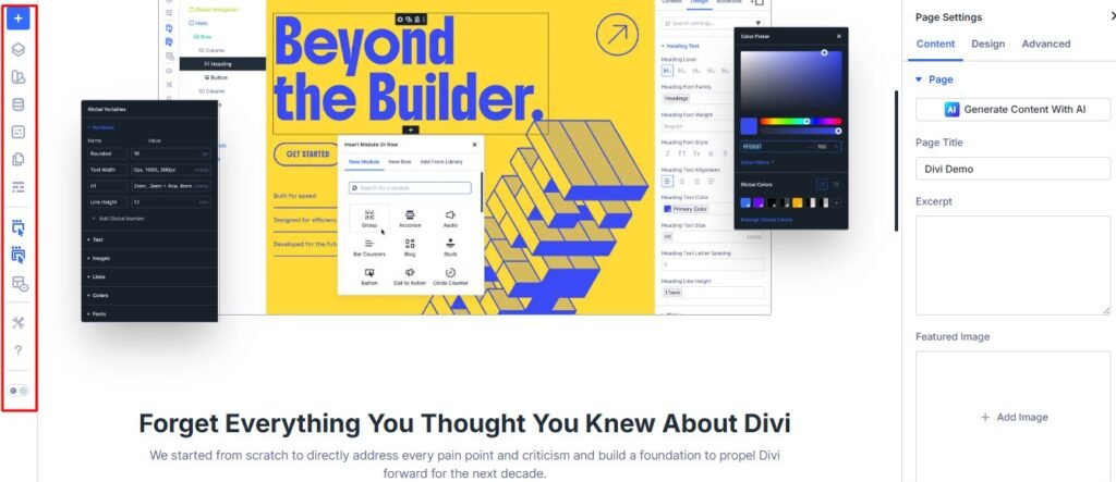
Understanding the Divi Builder Interface and Theme Builder Dashboard (2026 Update)
When I first opened the Divi visual builder, I was greeted by an interface that looked nothing like anything I’d used before. Purple buttons floated over my page, there was a toolbar at the bottom, and I honestly had no idea what most of it did.
Let me walk you through each part of the interface so you don’t feel as lost as I did.
The Canvas: Your Live Preview Area
The canvas is the big area in the center of your screen. This is your actual page exactly as your visitors will see it. When I’m building in Divi, I’m not working in some separate preview mode. I’m directly editing the real page. This was mind-blowing to me because other tools I’d used required constant switching between edit mode and preview mode.
Everything I change on the canvas updates instantly. I click a button and change its color, and I see the new color immediately. I adjust spacing, and the elements move right before my eyes. This real-time visual feedback makes designing feel natural and intuitive.
The canvas shows your page exactly as it will appear to visitors. When I add a new section, it appears right there on the canvas. When I drag an element to move it, I see it move in real time.
One thing I love is that I can zoom in and out on my canvas. When I’m working on detailed design elements, I zoom in to see everything clearly. When I want to see how my overall page layout looks, I zoom out to get the big picture.
The canvas also shows helpful guides when you’re dragging elements around. Blue lines appear showing you exactly where your element will land when you drop it. This visual feedback prevents mistakes and makes positioning elements precise.
Bottom Toolbar: Quick Access to Key Features
At the bottom center of your screen sits the Divi toolbar. This confused me at first because some of the icons weren’t immediately obvious, but once I learned what each one did, I used them constantly.
The purple three-dot button on the left opens builder settings. I can customize how the builder behaves, set preferences, and access advanced options. I rarely need this, but it’s there when I want to fine-tune my workflow.
Moving to the middle of the toolbar, I find the most important buttons. There’s a button to load layouts from the template library, save my current layout, clear the page, access page settings, view revision history, and search for elements. These are your most-used tools.
The revision history button became my best friend after I accidentally deleted a section I’d spent an hour designing. I clicked the clock icon, saw all my recent changes listed, and restored my page to just before I made the mistake. Crisis averted.
On the right side of the toolbar, I have my save button. This is crucial. Divi autosaves my work, but I still click save manually whenever I make changes I want to keep. Better safe than sorry.
There’s also a responsive view toggle that lets me switch between desktop, tablet, and mobile preview. I use this constantly because I need to make sure my pages look good on all devices.
Settings Panel: Where You Customize Everything
When I click on any element in my page, a settings panel appears. In the current version of Divi, this panel can appear as a popup in the center of your screen, or you can snap it to the right side.
I prefer snapping it to the right side. This gives me the canvas on the left showing my page, and the settings on the right where I can make adjustments. I can see my changes in real time while I work.
The settings panel has three tabs across the top: Content, Design, and Advanced. Each tab controls different aspects of whatever element I’m editing.
The Content tab is where I change what the element actually says or displays. If I’m editing a text module, I type my text here. If I’m editing an image module, I upload my image here. This tab controls the actual content.
The Design tab controls how the element looks. Colors, fonts, spacing, borders, shadows—all the visual styling happens in the Design tab. I spend most of my time here making things look exactly how I want them.
The Advanced tab has options for custom CSS, visibility settings, and animations. When I want an element to fade in as someone scrolls down the page, I set that in the Advanced tab. When I want to hide an element on mobile devices but show it on desktop, that’s also in Advanced.
Layers Panel: Navigate Complex Pages Fast
The Layers Panel was a feature I ignored for months because I didn’t understand what it did. Once I figured it out, it changed how I work with complex pages.
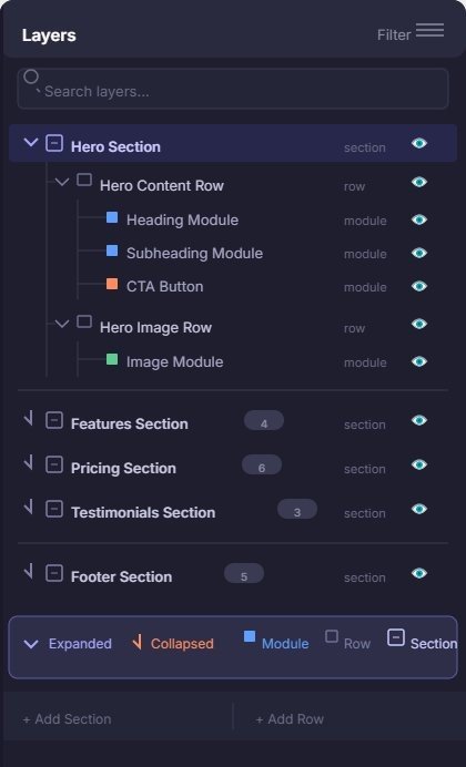
You can open the Layers Panel by clicking an icon in the bottom toolbar. When it opens, you see a tree view of your entire page structure. Every section, row, and module is listed in a hierarchical outline.
This is incredibly useful when you have a long page with many sections. Instead of scrolling through your entire canvas trying to find the specific element you want to edit, you just open the Layers Panel, click the element in the list, and Divi jumps straight to it.
I use this all the time when I’m working on long landing pages or complex layouts. It’s like having a map of your page that lets you teleport to any element instantly.
You can also drag and drop elements in the Layers Panel to reorganize your page. Sometimes this is easier than dragging on the canvas, especially when elements are close together.
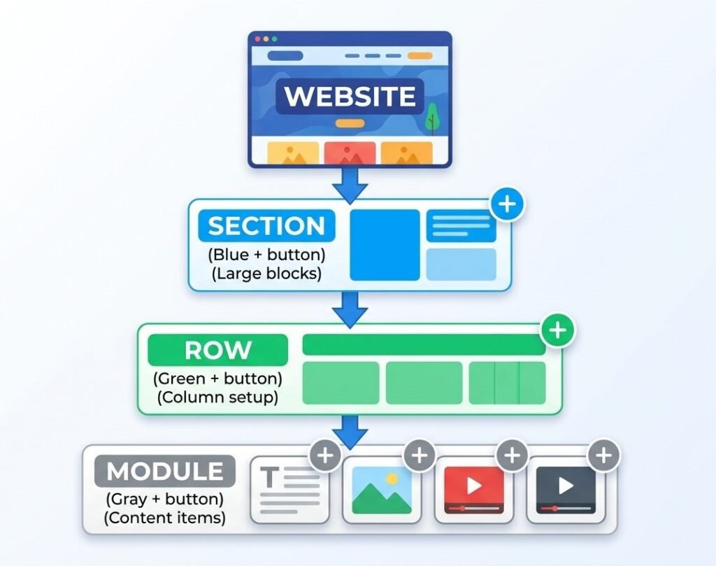
The Building Blocks: Sections, Rows, and Divi Modules Explained
This is the most important concept to understand about Divi, and it’s also the concept that confused me the most at the beginning. Everything in Divi is built using three types of building blocks, and they nest inside each other in a specific hierarchy.
Let me explain this the way I wish someone had explained it to me.
Sections are the largest containers. They’re the big horizontal blocks that stretch across your page. When you start building a new page from scratch, the first thing you do is add a section. Sections are the foundation of your page layout.
Rows sit inside sections. A row defines your column structure. Do you want one column spanning the full width? Two columns side by side? Three columns? Four? The row determines this. Rows are where you establish your page layout structure.
Modules are the actual content elements that sit inside the columns of your rows. Text, images, buttons, videos, forms, everything you see on your page is a divi module. Modules are the individual building blocks that create your content.
The hierarchy always works the same way. Section contains rows, rows contain modules. You can’t put a module directly in a section without a row. You can’t put a row outside of a section. Once I understood this structure, building pages became logical instead of confusing.
Sections: The Blue (+) Containers
When you’re building a page and you see a big blue button with a plus sign, that’s where you add a new section. Sections are marked in blue throughout the Divi interface.
There are three types of sections, and I use different types for different purposes.
Regular sections are the most common. They contain rows with columns, and they’re perfect for most content. My about sections, service sections, and content areas all use regular sections. This is your default choice for most designs.
Fullwidth sections stretch edge to edge and don’t use the column system. They’re perfect for fullwidth sliders, fullwidth headers, or any design element that needs to span the entire width of the browser. I use fullwidth sections for hero images and big visual statements.
Specialty sections let you create complex column layouts where different rows have different column structures. I rarely use these as a beginner, but they’re powerful for advanced layouts once you master the basics.
When I click to add a new section, Divi asks me which type I want. Most of the time I choose regular section.
Rows: The Green (+) Column Layouts
After I add a section, I see a green plus button inside it. This is where I add a row and choose my column structure.
Divi shows me a visual grid of column options. One column, two columns side by side, three columns, four columns, and many other combinations. I just click the layout I want.
Two columns side by side is probably my most used layout. I put an image in the left column and text in the right column. Or vice versa. This creates a nice balanced look that I use constantly on service pages and feature sections.
One cool feature I discovered is that I can resize columns by dragging. If I have two columns but I want the left one to be wider than the right one, I just drag the divider between them. Visual sliders appear, and I adjust the percentages until it looks right.
I can also add multiple rows inside the same section. My homepage has a section with three rows. The first row has one column with a headline. The second row has two columns with features. The third row has one column with a call to action button. All three rows live in one section because they’re all part of the same conceptual block of content.
Modules: The Gray (+) Content Elements
Finally, we get to modules. These are the actual things your visitors see and interact with. After I’ve created a section and added a row with columns, I see gray plus buttons inside each column. This is where I add divi modules.
Divi has over 40 different divi modules. Text modules, image modules, button modules, video modules, slider modules, testimonial modules, pricing table modules, contact form modules—the list goes on.
When I click the gray plus button, a menu opens showing me all available modules organized by category. I can search for a specific module or browse through them.
I use text modules and image modules most often because those are the basics of most web pages. But I also love the button module for creating call to action buttons, the blurb module for icon and text combinations, and the slider module for image carousels.
Each divi module has its own settings. A text module lets me format my text, choose fonts and colors, and adjust spacing. An image module lets me upload an image, add alt text, and control sizing. Every module is customized through the settings panel I mentioned earlier.
Understanding Parent-Child Relationships in Sections
Here’s something that confused me until I understood the parent-child relationship.
When I change settings on a section, those settings affect everything inside that section. If I give my section a blue background, the entire section turns blue, including all the rows and modules inside it. This is the parent-child relationship in action.
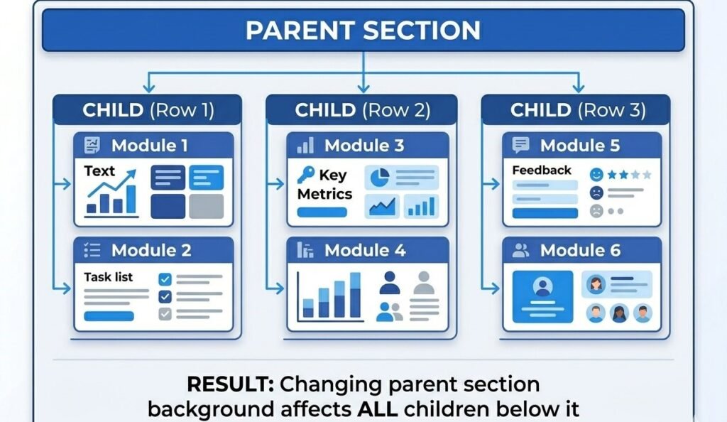
If I add padding to a section, it creates space around everything inside the section. The rows and modules don’t move individually. They all move together because they’re children of the section.
This is actually really useful once you understand it. I can control the overall look of a big block of content by adjusting the section settings, rather than adjusting every individual element inside it.
The same relationship exists between rows and modules. If I set a row background color, it affects all the columns in that row. If I adjust row padding, all the modules inside the row are affected.
Understanding this hierarchy saved me so much time. Instead of adjusting ten different modules individually, I adjust the section or row that contains them, and they all change together.
Divi Theme Builder Tutorial: Step-by-Step Guide to Creating Your First Global Template
Now let me walk you through creating your first global template using the theme builder. I’m going to show you how to create a custom header because that’s the most immediately useful template you can build with the theme builder dashboard.
This tutorial assumes you already have Divi installed and activated on your WordPress website. If you don’t have it set up yet, you’ll need to do that first.
Step 1: Access the Theme Builder Dashboard
From your WordPress dashboard, hover over Divi in the left sidebar menu. A submenu appears, and you’ll see an option called Theme Builder. Click it.
The first time I opened the theme builder dashboard, I saw a screen explaining what the theme builder does. There’s a big button in the center that says something like “Get Started” or “Build New Template.” I clicked it.
If you’ve used the theme builder before, you’ll see a list of any templates you’ve already created in the theme builder dashboard. At the top, there’s a button to add a new template. That’s what you want when creating a new global template.
Step 2: Add Your First Global Template Through Theme Builder Settings
After clicking to create a new template, Divi asks me what I want to name my global template. I choose something descriptive like “Main Site Header” or “Default Header.” Naming it clearly helps when I have multiple templates later and need to manage them through the theme builder settings.
Then I have to choose where this template will be used. Divi shows options like “All Pages,” “All Posts,” specific pages, specific categories, and many other targeting options in the theme builder settings.
For my first header, I usually select “All Pages” because I want this header template to appear on every page of my website. I can always change this later through the theme builder settings or create additional headers for specific situations.
Step 3: Choose Template Type (Header, Body, or Footer)
After setting where my template applies, I choose what type of template I’m creating in the theme builder. The three options are Header, Body, and Footer.
Header is the top section of your website that typically contains your logo, navigation menu, and maybe some additional elements like contact information or a search bar.
Body is the main content area. For blog posts, this would be where your post content appears. For pages, it’s the main page content. This is where your single post layout template would control the design.
Footer is the bottom section with copyright info, footer menus, social media links, and other elements you want at the bottom of every page.
Since I’m creating a header template, I select Header. Divi then asks if I want to build from scratch or use a premade layout. Just like with page building, I can choose a template to start with through the template library.
For my very first header template, I chose a premade layout because I wanted to see how a professional header was structured. I picked one that had a logo on the left and a menu on the right, which is a classic layout that works well.
Step 4: Build Your Header Template Using Divi Modules
Once I’ve chosen my starting point, the Divi visual builder opens, and I’m editing my header template. If I started from a premade layout, I see a complete header already built. Now I customize it to make it mine.
I click on the logo placeholder and upload my own logo image. I click on the menu and make sure it’s pulling in my WordPress navigation menu. If I have other elements like a search icon or a call to action button, I customize those too.
If I started from scratch, I’d add sections, rows, and divi modules just like building a regular page. A simple header might have one fullwidth section with a row containing two columns. In the left column, I’d add an image module for my logo. In the right column, I’d add a menu module for my navigation.
I spent about 30 minutes on my first custom header, adjusting colors, spacing, and typography until it looked exactly how I wanted. Once I was happy with it, I moved to the next step.
Step 5: Configure Template Display Conditions and Theme Builder Settings
This is a step I didn’t fully understand at first, and I made some mistakes because of it. Display conditions in the theme builder settings control where and when your template appears.
In the theme builder dashboard, each template has settings for display conditions. I can say “show this header on all pages” or “show this header only on blog posts” or “show this header everywhere except the homepage.”
When I was building my first site, I created a header template and couldn’t figure out why it wasn’t showing up. Turns out I had set the display conditions to only show on posts, but I was looking at pages. Once I changed the condition to “all pages,” it appeared everywhere I wanted it through the theme builder settings.
You can get really specific with display conditions through the theme builder settings. Show certain headers to logged-in users. Show different headers on different categories. Show specific headers on WooCommerce shop pages. The flexibility is amazing once you understand how it works.
For a basic site, setting your header to appear on “all pages” and “all posts” is usually what you want.
Step 6: Save and Activate Your Global Template
After I’ve built my template and set the display conditions in the theme builder settings, I need to save it and make sure it’s activated.
In the theme builder dashboard, each template has a toggle switch. When the switch is purple and to the right, the template is active. When it’s gray and to the left, the template is disabled.
I made the mistake once of building a beautiful header template, saving it, but forgetting to enable the toggle in the theme builder settings. I spent 20 minutes wondering why my header wasn’t showing up on my site. Then I noticed the toggle was off. I switched it on, refreshed my page, and there was my header template.
Once your template is activated and saved in the theme builder, it immediately starts appearing on your website according to the display conditions you set. You can visit any page on your site, and you’ll see your new custom header at the top.
The cool thing is that you only build this once. Every page on your website now has this header automatically through your global template. When you want to update your header in the future, you edit the template once, and the changes appear everywhere instantly.
How to Customize Your WordPress Header with Theme Builder: Practical Customization Guide
Creating a basic header template is just the start. Let me show you some specific WordPress customization techniques that really make your header stand out.
Changing Header Background and Colors Through Theme Builder Settings
One of the first things I wanted to do was change my header background color to match my brand. I opened my header template in the visual builder, clicked on the section that contained my header, and the settings panel opened.
In the Design tab, I found the Background option. I could choose a solid color, a gradient, or even an image background. I chose a solid color and used my brand’s primary color.
I also adjusted the text colors in my menu so they would be readable against my background. If I had a dark background, I needed light text. If I had a light background, I needed dark text. This seems obvious, but I’ve seen plenty of websites where the header text is barely visible because the colors weren’t chosen carefully.
Making Your Header Sticky with Theme Builder Settings
A sticky header stays visible at the top of the screen even when someone scrolls down the page. This is useful because visitors can always access your navigation menu without scrolling back to the top.
To make my header sticky, I clicked on the section containing my header, went to the Advanced tab in the theme builder settings, and found the Sticky option. I enabled it, and suddenly my header stayed fixed at the top of the screen when I scrolled.
I could also customize how the sticky header looked when scrolling. Some people want the header to shrink when it becomes sticky, so it takes up less screen space. The theme builder settings in Divi let you adjust the styling specifically for the sticky state.
My first sticky header was a bit too tall and blocked too much of the screen when scrolling. I adjusted the padding to make it more compact in sticky mode, and it looked much better.
Customizing Menu Styles and Fonts in Your Header Template
The menu module has extensive styling options through the theme builder settings. I could change the font family, size, weight, and spacing. I could adjust the color of links, the color when hovering over links, and the color of the active page.
I spent time making sure my menu matched my overall site design. If my site used a modern sans serif font, I made sure my menu used the same font. If my site had a specific accent color, I used that color for menu hover states in the theme builder.
One thing I learned is that menu spacing matters in your header template. If my menu items are too close together, they feel cramped. If they’re too far apart, the menu feels disconnected. I adjusted the spacing through the theme builder settings until it felt balanced and comfortable to look at.
The Fast Way: Using Divi’s Premade Layouts, Template Library, and AI Site Generation
When I first started building with Divi, I tried to create everything from scratch because I thought that was what real designers did. I wasted so much time reinventing layouts that already existed in Divi’s template library.
Let me save you that time by showing you the smart way to build quickly.
Method 1: Browse and Import from Divi Template Library
Divi has a massive library with over 2,000 premade layouts. These aren’t just basic templates. They’re professionally designed, fully built pages organized by industry and purpose. This template library is one of Divi’s biggest advantages.
When I’m building a new page, I click the option to choose a premade layout from the template library. A window opens showing me categories like Business, Restaurant, Photography, Fitness, Education, and many more.
I can search by keyword too. If I type “photography,” I see all the photography-related layouts in the template library. If I type “pricing,” I see layouts with pricing tables.
I pick a layout that’s close to what I want from the template library, click it, and Divi imports it onto my page. Now instead of starting with a blank canvas, I have a complete professional design to work with.
Then I customize it. I replace the placeholder images with my own images. I change the text to my own content. I adjust colors to match my brand. In 30 minutes, I have a page that would have taken me hours to build from scratch using the template library.
I used to feel like using templates from the template library was cheating. Now I realize it’s just smart. Why spend four hours designing something when I can start with a professional template from the template library and customize it in one hour?
The key is to actually customize it. Don’t just use the template as-is with the stock photos and placeholder text. Make it yours by adding your own content and adjusting the design to fit your brand.
Method 2: Generate Entire Site with Divi AI Site Builder
Divi 5 introduced an AI-powered site builder that honestly blew my mind the first time I used it. Instead of choosing layouts manually from the template library, I can describe my website to the AI, and it generates an entire multi-page site for me.
I click the option to generate with AI, and Divi asks me questions about my website. What industry am I in? What’s my website about? What pages do I need?
I type answers like “I’m a freelance photographer specializing in weddings” or “I run a coffee shop in Portland.” The AI uses this information to generate a complete website with homepage, about page, services page, contact page, and more all built automatically.
When I first tried this, I was skeptical. I thought it would generate something generic and unusable. I was wrong. The AI created a genuinely good-looking website with relevant content, appropriate images from stock photo libraries, and layouts that made sense for my industry.
Of course, the content wasn’t perfect. The AI doesn’t know my specific story, my actual services, or my real personality. But it gave me an excellent starting point that I could then refine and personalize.
I used AI generation to build a quick portfolio site for a friend. In 10 minutes, I had a complete five-page website from the AI site builder. Then I spent another hour swapping in real photos, writing actual content, and adjusting the design. Total time: about 70 minutes for a complete custom website.
Why You Should Always Customize Templates and Layouts
Whether I use a premade layout from the template library or AI generation, I always customize it significantly before publishing. Here’s why.
Stock photos look like stock photos. They’re fine as placeholders, but they don’t represent your real business. I replace every stock photo with real images, even if my photos aren’t quite as polished. Authenticity beats perfection.
Generic text doesn’t connect with readers. The placeholder text in template library layouts is written broadly to fit anyone. I rewrite it in my own voice with my specific message. This makes the website actually yours instead of just a template.
Default colors might not match your brand. If your business has specific brand colors, I go through and update the template colors to match. This creates consistency and makes the design feel cohesive with your overall branding.
Templates give you a professional structure and save time on layout decisions. But the content, images, and specific styling are what make the website uniquely yours. Never skip the customization step.
How to Edit Divi Modules: Settings Panel Breakdown
Every time I click an element in Divi, a settings panel opens. Understanding what each tab does and where to find specific options made me so much faster at building websites with divi modules.
Let me walk through each tab and show you what I use most often.
Content Tab: What Your Divi Module Says and Does
The Content tab is where I control what the element actually displays. For a text module, this is where I write the text. For an image module, this is where I upload the image. For a button module, this is where I set the button text and link destination.
I think of the Content tab as the “what” tab. What does this divi module say? What does it show? What does it link to?
When I’m editing a text module, the Content tab has a text editor similar to the WordPress post editor. I can format text, add links, create lists, and style the content directly in the divi module settings.
For more complex divi modules like sliders or accordions, the Content tab is where I add each individual slide or accordion item. I click “Add New Item” and fill in the content for each piece.
Design Tab: How Your Divi Module Looks
The Design tab controls all the visual styling in your divi module. Colors, fonts, spacing, borders, shadows, everything that affects how the element looks happens here.
This is where I spend most of my time because visual design is what makes a website look professional or amateur.
Typography settings let me choose the font family, adjust the size, set the weight, change the line height, and control letter spacing in my divi modules. Getting typography right is crucial for readability and overall design quality.
Color settings let me set text color, background color, border color, and any other colors the specific divi module uses. I always make sure there’s enough contrast between text and background for readability in every module.
Spacing is huge. Padding adds space inside the divi module. Margin adds space around the module. When things feel too cramped or too spread out, I adjust padding and margins until the spacing feels right.
Borders and shadows add depth and definition to divi modules. A subtle shadow can make a button or card stand out from the background. A border can define sections and create visual separation.
Advanced Tab: Pro Features for Divi Modules
The Advanced tab has options I didn’t touch for the first few months using Divi. Now I use some of them regularly for advanced divi module customization.
Custom CSS classes and IDs let me add my own code to divi modules. If I know CSS, I can write custom styles. I rarely need this since Divi’s visual options cover most styling needs for modules.
Visibility settings let me show or hide divi modules on different devices. I’ve used this to hide certain modules on mobile that take up too much space or aren’t necessary on small screens.
Animations add movement when divi modules appear on the page. I can make elements fade in, slide in, zoom in, or bounce in as someone scrolls down the page. Used sparingly, animations add polish and professionalism to modules.
Transitions control how elements change when you hover over them. If I want a button module to smoothly change color when someone hovers their mouse over it, I adjust the transition speed in the Advanced tab.
Making Your Site Mobile-Friendly: Responsive Design in Divi
I made a huge mistake on my first website. I designed everything on my desktop computer, and it looked beautiful. Then I checked it on my phone, and it was a disaster. Text was too small to read, buttons were too close together, and some elements overlapped.
That’s when I learned that responsive design isn’t optional. Over 60% of web traffic comes from mobile devices. If your site doesn’t work well on phones and tablets, you’re losing more than half your potential audience.
How to Preview Your Site on Different Devices
Divi makes responsive design easier with device preview buttons in the bottom toolbar. There are three icons representing desktop, tablet, and mobile.
When I click the tablet icon, my canvas resizes to tablet width, and I see exactly how my page looks on a tablet. When I click the mobile icon, the canvas shrinks to phone size.
I always preview on all three devices before I publish any page. What looks perfect on desktop might be completely broken on mobile, and I need to catch those problems before my visitors see them.
Adjusting Spacing and Fonts for Mobile Devices
Here’s something that took me a while to understand. When I’m in mobile preview mode and I adjust a setting, I’m adjusting it ONLY for mobile. Desktop and tablet stay the same.
This is powerful because it means I can have different spacing and font sizes for different devices in my responsive design.
On desktop, I might have large bold text with lots of spacing around it. On mobile, I make that text smaller and reduce the spacing because there’s less screen space to work with.
I click the mobile preview icon, then I go into my element settings and adjust padding, margin, and font size. I see the changes immediately on the mobile preview.
Each device can have completely different settings in your responsive design. My desktop heading might be 48 pixels. My tablet heading might be 36 pixels. My mobile heading might be 24 pixels. Divi handles all of this automatically once I set the sizes for each device.
Common Mobile Design Mistakes to Avoid
Too much padding on mobile is the mistake I made most often at first. I’d have beautiful generous spacing on desktop, and that same spacing would carry over to mobile. Suddenly my mobile page was 90% white space with tiny bits of content in between.
I learned to reduce padding on mobile in my responsive design. Elements can be closer together on a small screen because the overall layout is more compact anyway.
Text that’s too large or too small causes problems. If desktop text is readable at 18 pixels, that might be too small on mobile where the screen is farther from your eyes. I usually increase body text size slightly on mobile in my responsive design.
Images that are too wide cause horizontal scrolling, which is terrible for user experience. Divi usually handles image sizing automatically, but I always check to make sure images aren’t breaking the mobile layout in my responsive design.
Buttons that are too small are hard to tap on a touchscreen. I make sure mobile buttons are at least 44 pixels tall because that’s the minimum comfortable tap target size.
Troubleshooting: Why Your Divi Theme Builder Isn’t Working (And How to Fix It)
I’ve run into several frustrating situations where the theme builder just wouldn’t work the way I expected. Let me share the problems I encountered and how I fixed them.
Fix 1: Template Not Appearing on Your Website
This was the most common problem I faced. I built a beautiful header template, saved it, and then visited my website expecting to see it. It wasn’t there.
First thing I check: Is the template actually enabled? In the theme builder dashboard, there’s a toggle switch next to each template. If it’s gray and pushed to the left, the template is disabled. I click the toggle to turn it purple and push it to the right. That enables the template.
Second thing I check: Display conditions. Maybe I set my header to only appear on blog posts, but I’m looking at a page. Or maybe I accidentally excluded the page I’m viewing.
I go back to the theme builder, click the settings icon next to my template, and review where it’s assigned to display. I adjust the conditions to include the pages where I want the template to appear.
Third thing I check: Template conflicts. If I have multiple templates assigned to the same location, one might be overriding the other. Divi has a priority system where more specific templates take precedence over general ones.
For example, if I have a header assigned to “all pages” and another header assigned to my homepage specifically, the homepage-specific header will show on the homepage. That’s working as designed, but it might not be what I intended.
Fix 2: Changes Not Saving or Disappearing
I once spent 45 minutes customizing a template, clicked save, and left for the day. The next morning, none of my changes were there. I was devastated.
Here’s what I learned. First, make sure you’re actually clicking the save button. Divi autosaves your work periodically, but manual saves are more reliable. The save button is in the bottom right corner of the visual builder. Click it, wait for the confirmation, then you’re safe.
Second, browser cache can cause problems. Your browser might be showing you an old cached version of your page even though your changes saved. I clear my browser cache or do a hard refresh by pressing Ctrl+F5 on Windows or Cmd+Shift+R on Mac.
Third, WordPress permissions might prevent saving. This is rare, but if your hosting environment has file permission problems, Divi might not be able to write your changes. Contact your web host if you suspect this is the issue.
If changes keep disappearing, try editing in a different browser. I had a browser extension once that interfered with Divi. Switching to a different browser solved the problem immediately.
Fix 3: Can’t Find Visual Builder Button
Sometimes the “Enable Visual Builder” button just isn’t where it should be. This usually comes down to a few possible causes.
Make sure Divi is actually activated. I know this sounds obvious, but I once spent time troubleshooting only to realize I had accidentally switched to a different WordPress theme. Check Appearance, Themes in your WordPress dashboard and verify Divi is active.
Check your user role. Only administrators can use the visual builder by default. If you’re logged in as an editor or another role, you won’t see the button. Make sure you’re logged in as an administrator.
Try accessing it from a different location. If the button isn’t showing when viewing your page on the frontend, try going to Pages in your dashboard, editing the page, and clicking “Use Divi Builder” from there instead.
Some plugins conflict with Divi and hide the visual builder button. If you recently installed a new plugin and the button disappeared, try deactivating that plugin temporarily to see if it’s causing the conflict.
Fix 4: Template Conflict Issues
I ran into a confusing situation where I had two different headers showing up on the same page, one on top of the other. It looked ridiculous.
The problem was that I had assigned two header templates to the same page. One was set to appear on “all pages” and another was set to appear on that specific page category.
Divi tried to show both, which created the weird double header. I fixed it by going to the theme builder dashboard, reviewing all my active templates, and disabling the one I didn’t want.
When templates conflict, the more specific one usually takes priority. A template assigned to a specific page beats a template assigned to all pages. A template assigned to a category beats a template assigned to all posts.
Understanding this priority system helps you set up templates correctly and avoid conflicts.
Divi Builder Productivity Hacks: Build Faster and Smarter
After years of using Divi, I’ve discovered shortcuts and techniques that make me much faster at building websites. Let me share my favorite productivity tips.
Use Layers Panel for Fast Navigation on Complex Pages
When I’m working on a long page with 10 or 15 sections, scrolling through the canvas to find the specific element I want to edit gets tedious. The Layers Panel solves this.
I open the Layers Panel from the bottom toolbar, and I see a complete outline of my page structure. I can collapse sections I’m not working on and expand the section that contains the element I need.
I click the element name in the Layers Panel, and Divi immediately jumps to that element on the canvas and opens its settings. This saves me so much time compared to scrolling and clicking around trying to find things.
I can also rearrange my page structure by dragging elements in the Layers Panel. Sometimes this is easier than dragging on the canvas, especially when elements are visually similar or close together.
Snap Settings Panel to the Side for Real-Time Editing
By default, the settings panel opens as a popup window in the center of your screen. This covers your canvas and makes it hard to see your changes in context.
I click the little icon in the top right of the settings panel that looks like two rectangles. This snaps the settings panel to the right side of my screen.
Now I have my canvas on the left showing my page, and the settings panel docked on the right. I can make adjustments in the settings and immediately see how they affect my page. This side-by-side view speeds up my design process significantly.
I can resize the panels by dragging the divider between them. If I need more space for the canvas, I make the settings panel narrower. If I need to see more settings options at once, I make it wider.
Search for Settings Instead of Scrolling
Divi modules have tons of settings. The button module alone has hundreds of options across the three tabs. Finding a specific setting by scrolling through all the options takes forever.
The search bar at the top of the settings panel is a huge time saver. I click it, type a keyword like “shadow” or “spacing,” and Divi filters the settings to show only options matching my search.
This instantly takes me to what I need without scrolling through dozens of unrelated options. I use this feature constantly when working with complex modules.
Toggle Wireframe Mode to See Page Structure
When I’m working on complex layouts with lots of nested elements, the visual design can actually make it harder to see the structure. Colors, images, and text distract from the underlying layout.
Wireframe mode strips away all the visual design and shows just the structure. Sections, rows, and modules are displayed as labeled boxes in a hierarchy.
I toggle wireframe mode from the bottom toolbar. It’s the icon that looks like a grid. When I click it, my beautiful designed page turns into a simple structural outline.
This makes it easy to see exactly how my page is organized. I can quickly identify which sections contain which rows and rearrange things without visual clutter.
I use wireframe mode when I’m planning a layout or reorganizing a page. Then I toggle back to normal view when I’m working on visual design.
Copy and Paste Styles Between Elements
I spent way too much time manually styling elements the same way until I discovered style copying. If I have a button styled exactly how I want it, I can copy those styles and paste them onto other buttons.
I right-click the element I want to copy from and select “Copy Button Styles” from the menu. Then I right-click the element I want to apply those styles to and select “Paste Button Styles.”
Instantly, the second button has the same colors, fonts, borders, shadows, and spacing as the first one. I can do this with any element type. Copy section styles, paste them to other sections. Copy text module styles, paste them to other text modules.
This ensures consistency across my website and saves enormous amounts of time.
Save Favorite Designs to Library for Reuse
When I create a section or module that I really love and want to use on other pages or websites, I save it to my library.
I click the three-dot menu on the element and select “Save to Library.” I give it a descriptive name like “Testimonial Card Blue” or “Call to Action Section.”
Now I can load this saved element on any page. I add a new section or module, click “Add from Library” instead of choosing a module type, and select my saved design from the list.
I have a personal library of sections I’ve designed that I reuse constantly. A hero section design, a services section layout, a contact form design—all ready to drop into any project.
Use Keyboard Shortcuts to Speed Everything Up
I didn’t bother learning keyboard shortcuts at first because I thought clicking was fine. Once I learned a few basic shortcuts, I realized how much time I was wasting.
- Ctrl+Z (or Cmd+Z on Mac) undoes the last action. I use this constantly when I’m experimenting. Try something, don’t like it, undo.
- Ctrl+S (or Cmd+S on Mac) saves your work. I hit this combination reflexively now after making changes I want to keep.
- Ctrl+D duplicates the selected element. Instead of right-clicking and selecting duplicate from a menu, I just hit Ctrl+D.
- Escape closes the settings panel. When I’m done editing an element, I hit Escape instead of clicking the X.
These small shortcuts add up. When you’re building a complete website, saving two seconds on actions you do 500 times means you save 16 minutes total.
Frequently Asked Questions About Divi Page Builder and Theme Builder
Do I need coding skills to use Divi page builder?
No, you don’t need any coding skills at all. I had zero coding knowledge when I started using Divi, and I built complete websites. The entire system is visual and drag-and-drop. You click elements, drag them where you want them, and customize everything through visual controls like color pickers, sliders, and dropdown menus.
If you do know CSS or want to add custom code, Divi gives you that option in the Advanced tab of every element. But it’s completely optional. I’ve built dozens of professional-looking websites without writing a single line of code.
What’s the difference between Divi page builder and Divi theme builder?
The page builder is for creating individual unique pages on your website. When you want to design a specific About page or landing page, you use the page builder. Each page can have a completely different layout and design.
The theme builder is for creating global templates that repeat across your website. Your header that appears on every page, your footer, your blog post template—these are all built with the theme builder. You design them once, and they automatically appear wherever you assign them through display conditions.
You use both tools together. The theme builder creates your site structure and consistency. The page builder creates unique pages within that structure.
Can I use Divi builder with any WordPress theme?
Yes, if you install the Divi builder plugin instead of the Divi theme. The plugin version of Divi builder adds the page-building functionality to whatever theme you currently have installed.
However, the plugin version only gives you the page builder, not the theme builder. If you want to create custom headers and footers with Divi, you need to use the full Divi theme, not just the plugin.
I started with the plugin because I didn’t want to change my WordPress theme. After a few months, I switched to the full Divi theme because I wanted access to the theme builder features.
Why isn’t my Divi template showing up on my website?
The most common reasons are either the template isn’t enabled or the display conditions are wrong.
Check the theme builder dashboard and make sure the toggle switch next to your template is purple and pushed to the right. If it’s gray and to the left, click it to enable the template.
Then check the display conditions. Click the settings icon next to your template and verify it’s assigned to show on the pages where you’re looking for it. If you set it to show only on posts but you’re viewing a page, it won’t appear.
Also check if you have multiple templates assigned to the same area. More specific templates override general ones, which might be why you’re not seeing the template you expected.
How do I make my Divi site mobile-friendly?
Use the responsive preview buttons in the bottom toolbar to switch between desktop, tablet, and mobile views. When you’re in mobile preview mode, any adjustments you make to spacing, font sizes, or layout apply only to mobile devices.
I always preview my pages on all three device sizes before publishing. What looks perfect on desktop often needs adjustments on mobile. Usually, I reduce padding and margin on mobile because screen space is limited. I also sometimes adjust font sizes to ensure text is readable on small screens.
Divi handles most responsive adjustments automatically, but you should always check manually to make sure everything looks good on phones and tablets.
Should I build from scratch or use Divi’s premade layouts?
For beginners, I strongly recommend starting with premade layouts from the template library. Divi has over 2,000 professional templates that give you an excellent starting point. Pick one that’s close to what you want, import it, then customize it with your own content, images, and colors.
Building from scratch is fine once you’re comfortable with how Divi works, but there’s no reason to reinvent the wheel when beautiful layouts already exist in the template library. Even professional designers use templates to save time.
The key is to customize the template. Don’t just use it as-is with the stock photos and placeholder text. Make it yours by adding your actual content and adjusting the design to match your brand.
Can I undo mistakes in Divi builder?
Yes, Divi has several safety features. The easiest is keyboard shortcuts. Press Ctrl+Z on Windows or Cmd+Z on Mac to undo your last action. You can undo multiple steps by pressing it repeatedly.
You can also click the clock icon in the bottom toolbar to open revision history. This shows you a list of recent changes to your page. You can click any previous state to restore your page to that point in time.
Divi also autosaves your work periodically, so even if your browser crashes, you usually won’t lose much progress. Plus, WordPress keeps revisions of published pages, so you can always restore an older version if needed.
Is Divi builder slow or bad for WordPress SEO?
Divi 5, which is the current version as of 2026, was completely rebuilt with performance as a priority. It’s significantly faster than older versions of Divi.
Any page builder adds some code to your website, but Divi 5 is optimized to minimize performance impact. Your site speed depends more on your hosting, image sizes, and other plugins than on Divi itself.
For WordPress SEO, Divi is perfectly fine. It generates clean code, and you have full control over SEO-important elements like heading tags, image alt text, and meta descriptions. Use an SEO plugin like Yoast or RankMath alongside Divi, optimize your images before uploading them, and your site will be SEO-friendly.
I’ve built websites with Divi that rank well in Google. The page builder isn’t holding you back from WordPress SEO success as long as you follow general SEO best practices.
Conclusion: Your WordPress Customization Journey Starts Here
I hope this guide helps you feel confident using the page builder and theme builder in WordPress with Elegant Themes Divi. I remember how overwhelmed I felt when I first started, and I wanted to share everything I learned so you don’t have to struggle through the same confusions I did.
The power of Divi lies in understanding how the two builders work together. The theme builder provides the global structure and consistency that makes your WordPress customization professional and cohesive. The page builder gives you the flexibility to create unique, stunning pages that capture attention and convert visitors.
Start simple. Create a basic header template using the theme builder. Build one custom page using the page builder. Experiment with the settings. Make mistakes and undo them. Learn how sections, rows, and modules relate to each other.
Don’t be intimidated by all the options. You don’t need to master every feature to create beautiful websites. Focus on the fundamentals first. Understanding the parent-child relationships, learning how to use the layers panel, and getting comfortable with responsive design will take you 90% of the way there.
Take advantage of the template library. There’s no shame in starting with a premade layout from the template library and customizing it. That’s how professionals work. That’s how you get quality results fast.
Experiment often, and don’t be afraid to try things and make mistakes. Divi gives you the tools to create professional WordPress websites, and with practice, you’ll be building beautiful pages faster than you ever thought possible. The Elegant Themes team has built something truly remarkable—a WordPress page builder that’s powerful enough for professionals but intuitive enough for beginners.
Your WordPress customization journey with Divi is just beginning. The websites you’ll create, the businesses you’ll help, and the time you’ll save are all ahead of you. Now go build something amazing.